Sunday, 27 November 2016

Art Noueau

Art Nouveau

It was an international decorative style that thrived roughly during the two decades that girded the turn of the century. Its identifying visual quality is an organic, plantlike line. It can either undulate with whiplash energy or flow with elegant grace as it defined, modulates, and decorated a given space. Art nouveau is a transitional style that evolved from the historicism that dominated design for most of the nineteenth century. The Victorians sought solutions through established historical approaches, while the modernists adopted a new international ornamental style, using elegant motifs aligned with nature and often distinguished by free and graceful lines. The organic linear movements frequently dominate the spatial area and other visual properties, such as colour and texture. Forms and lines were often invented rather than copied from nature or the past, there was a revitalization of the design process that pointed toward abstract art. 

Art Nouveau

Cheret and Grasset

Cheret was convinced that pictorial lithographic posters would replace the typographic letterpress posters that filled the urban environment, but he could not convince advertisers of this. He simplified his designs and increased the scale of his major figures and lettering. He worked directly on stone, whereby an artist's design was executed on the stones by craftsmen. During the 1880s he used a black line with the primary colors. This allowed subtle overprinting an astonishing range of colors and effects. Stipple and crosshatch, soft watercolor-like washes and bold calligraphic chunks of color, scratching, scraping, and splattering. Typical composition is a central figure in animated gesture, surrounded by swirls of color, secondary figures or props, and bold lettering that often echoes the shapes and gestures of the figure. 

Grasset's design ideas were rapidly assimilated after publication, including the decorative borders framing the contents, the integration of illustration and text into a unit, and the design of illustrations so that typography was printed over skies and other areas. His formal composition and muted color contrasted strongly with Cheret's informally composed, brightly colored work. His flowing line, subjective color, and ever-present floral motifs pointed toward French art nouveau.

Cheret's design


Grasset's design

English Art Nouveau

Aubrey Beardsley was the enfant terrible of art nouveau, with his striking pen line, vibrant black  and white work, and shockingly exotic imagery. He sythesized Japanese block prints and William Morris into a new idiom. He reproduced retained complete fidelity to the original art. The flat patterns and dynamic curves of art nouveau yielded to a more naturalistic tonal quality, and dotted contours softened the decisive line of his earlier work. He learned how to indicate figures and clothing with minimal lines and flat shapes with no tonal modulation. 

English Art Nouveau

Art Nouveau comes to America

Beardsley's style as a stepping-stone to fresh graphic technique and a visual unity of type and image that moved beyond imitation. He made innovative use of photo mechanical techniques to produce repeated, overlapping, and reversed images. Type became a design element to be squeezed into a narrow of letters became the same length and formed a rectangle. 

American Art Nouvea

Innovation in Belgium and the Netherlands

Privet Livemont produced nearly three dozen posters and was strongly inspired by Mucha's idealized women. His major innovation was a double contour separating the figure from the background. Were often outlined by a thick, white band, which increased the image's impact when posted on billboards. They brought about an important artistic revival in the Netherlands that provided the seeds for future movements such as De Stijl, art deco, and what is now known as the Wendingen style. The original discoveries were taken over by those who only saw their superficial appeal and continued t exploit them as fashionable decorative styles, easy to manipulate and applicable to almost any goal.

De Stijl

The German Jugendstil movement

Full double-page illustrations, horizontal illustrations across the top of a page, and decorative art nouveau designs brought rich variety to a format that was about half visual material and half text. Large-scale ornamentation ranged from Peter Behrens's abstract designs inspired by ancient Egyptian artifacts to stylized floral designs. Behrens became widely known for large, multicolor woodblock prints inspired by French art nouveau and Japanese prints. He experimented with ornaments and vignettes of abstract design through two other publications.

Jugendstil Movement

Bibliography


Anon, (2017). [online] Available at: http://file:///C:/Users/user/Desktop/Interactive%20Media/Contextual%20Studies/Meggs-History-of-Graphic-Design.pdf [Accessed 24 Jan. 2017].

The Arts and Crafts Movement and Its Heritage

Diagrams and symbols are printed in brilliant primary colors with woodblocks, color replaced traditional alphabet labeling to identify the lines, shapes, and forms in the geometry lessons. The dynamic color and crisp structures anticipate geometric abstract art of the twentieth century. This first treated the book as a limited edition art object and then influenced commercial production, which was largely a result of Arts and Crafts movement. This flourished in England during the last decades of the nineteenth century of the Industrial Revolution. William Morris's main inspiration were medieval arts and botanical forms. Morris tried to implement Ruskin's ideas, the tastelessness of mass-produced goods and the lack of honest craftsmanship might be addressed by a reunion of art with craft.

The Century Guild

The designs provide one of the links between the Arts and Crafts movements and the floral stylization of art nouveau. The medieval passions of the Arts and Crafts movement were reflected in the graphic designs of Image and Horne. Its careful layout and typesetting, handmade paper, and intricate woodblock illustrations made it the harbinger of the growing Arts and Crafts interest in typography, graphic design, and printing. It was a design and printing movement advocating an aesthetic concern for the design and production of beautiful books. It sought to regain the design standards, high-quality materials, and careful workmanship of printing that existed before the Industrial Revolution. Morris admired the well-crafted typographic ages, generous margins, wide line spacing, and meticulous printing alive with hand-cut woodblock illustrations, head and tailpieces, and ornamented capitals.


Century Guild

The Kelmscott Press

Morris had made a number of manuscript books, writing the text in beautifully controlled scripts and embellishing them with delicate borders and initials with flowing forms and soft, clear colors. Punches were made and revised for the final designs, which captured the essence of Jenson's work but did not slavishly copy it. The Kelmscott Press was committed to recapturing the beauty of incunabula books. This design approach was established in its early books. These have a wonderful visual compatibility with Morris's types and woodblock illustrations. The entire design would be developed through this fluid process, for Morris believed that meticulous copying of a preliminary drawing squeezed the life from a work. The influence between Morris and Kelmscott Press upon graphic design, was evidenced not just in the direct stylist imitation of the Kelmscott borders, initials and type-styles. 

The private press movement

Ruskin went furthest in establishing an idyllic workshop paradise became a major English voice calling for integration of art and industry in a later era. Illustration and ornament were rejected in the approximately fifty volumes produced there using fine paper, perfect presswork, and exquisite type and spacing. It possessed a ringing elegance and straightforward legibility with modest weight differences between the thick and thin strokes and a slightly compressed letter. 

Private Press Movement

A book-design renaissance

The long-range effect of Morris was a significant upgrading of book design and typography throughout the world. In Germany, this influence inspired a renaissance of arts-and-crafts activities, wonderful new typefaces, and a significant improvement in book design. Mass production was viewed as a necessary evil, cautiously tolerated, principally for economic reasons. Guidelines included symmetrical layouts, tranquil harmony and balance, careful margin proportions, proper letter and wrong spacing, single traditional typefaces in as few sizes as possible, and skillful letterpress printing. Typography existed for the book and all of the typefaces designed for this purpose. The most important German type designer in the Arts and Crafts movement was Rudolph Koch, a powerful figure who was deeply mystical and medieval in his viewpoints. His type designs ranged from original interpretations of medieval letterforms to unexpected new designs, such as the rough-hewn chunky letterforms.

Book-Design Renaissance


Arts and Crafts attitudes about materials, function, and social value became an important inspiration for twentieth-century designers. Its positive impact on graphic design continues a century through the revivals of earlier typeface designs, the continued efforts toward excellence in book design and typography, and the private press movement that continues to this day.


Bibliography


Anon, (2017). [online] Available at: http://file:///C:/Users/user/Desktop/Interactive%20Media/Contextual%20Studies/Meggs-History-of-Graphic-Design.pdf [Accessed 24 Jan. 2017].

Saturday, 26 November 2016

Graphic Design and the Industrial Revolution

Graphic communications became more important and more widely accessible during this period of incessant change. Technology lowered unit costs and increased the production of printed materials. Handicrafts greatly diminished as the unity of design and production ended. The nature of visual information was profoundly changed. The range of typographic sizes and letterform styles exploded. The use of color lithography passed the aesthetic experience of colorful images from the privileged few to the whole of society.

Inventions of Typography

Larger scale, greater visual impact and new tactile and expressive characters were demanded and the book typography that had slowly evolved from handwriting did not fulfill these needs. It was no longer enough for the twenty-six letters of the alphabet to function only as phonetic symbols. A fat-face typestyle is a roman face whose contrast and weight have been increased by expanding the thickness of the capital height. The rapid tilt in typographic design taste toward modern-style romans and new jobbing styles after the turn of the century seriously affected him. 

The antiques convey a bold, mechanical feeling through slablike rectangular serifs, even weight throughout the letters, and short ascenders and descenders. It seems that the English typefounders were trying to invent every possible design permutation by modifying forms or proportions and applying all manner of decoration to their alphabets. Typefounders also varied the depth of shading, producing everything from pencil-thin shadows to deep perspectives. The mechanization of manufacturing processes during the Industrial Revolution made the application of decoration more economical and efficient. Designers of furniture, household objects, and even typefaces delighted in design intricacy. 

Sans serifs, which became so important to twentieth-century graphic design, had a tentative beginning. The cumbersome early sans serifs were used primarily for subtitles and descriptive material under excessively bold fat faces and Egyptians.

Early Sans Serifs


The wood-type poster

Durable, light, and less than half as expensive as large metal types, wood type rapidly overcame printers' initial objections and had a significant impact on poster and broadsheet design. The designer had access to a nearly infinite range of typographic sizes, styles, weights, and novel ornamental effects, and the prevailing design philosophy often encouraged an eclectic style. Long words or copy dictated condensed type, and short words or copy were set in expanding fonts. Important words were given emphasis through the use of the largest available type sizes.

Wood-Type Poster

A revolution in printing

The first powered press was designed much like a handpress connected to a steam engine. Its innovations included a method of inking the type by rollers rather than by hand-inking balls. the horizontal movement of the type forms in the bed of the machine, and the movement of the tympan and frisket were automated. The type form was on a flat bed, which moved back and forth beneath a cylinder. The printing phase the cylinder rotated over the type, carrying the sheet to be printed. The value of high-speed steam-powered printing would have been limited without an economical and abundant source of paper. 

The mechanization of typography

Setting type by hand and then redistributing it into the job case remained a slow and costly process. Before the Linotype was invented, the high cost and slow pace of composition limited even the largest daily newspaper to eight pages, and books remained fairly precious. Ninety typewriter keys controlled vertical tubes that were filled with these matrixes. Each time the operator pressed a key, a matrix for that character was released. It slid down a chute and was automatically lined up with the other characters in that line. Melted lead was poured into the line of matrixes to cast a slug bearing the raised line of type. Handset metal typography for advertising and editorial headlines until the advent of phototypography in the 1960s.

Popular graphics of the Victorian era

The Victorians searched for a design spirit to express their epoch. Aesthetic confusion led to a number of often contradictory design approaches and philosophies mixed together in a scattered fashion. They defined design as a moral act that achieved the status of art through the designer's ideals and attitudes. They believed the integrity and character of civilization were linked to its design. Victorian graphic design captured and conveyed the values of the era. Sentimentality, nostalgia and a canon of idealized beauty were expressed through printed images of children, maidens, pupies and flowers. The production medium for this outpouring of Victorian popular graphics was chromolithography, an innovation of the Industrial Revolution that unleashed a flood of colorful printed images.

Popular Graphics of the Victorian Era

Bibliography


Anon, (2017). [online] Available at: http://file:///C:/Users/user/Desktop/Interactive%20Media/Contextual%20Studies/Meggs-History-of-Graphic-Design.pdf [Accessed 24 Jan. 2017].

Monday, 21 November 2016

An Epoch of Typographic Genius

To construct the new roman capital letters, a square was divided into a grid of sixty-four units. Each of these units was divided further into thirty-six smaller units for a total of 2,304 tiny squares. Italics were constructed on a smaller grid. The new letter designs had fewer calligraphic properties inspired by the chisel and flat pen. A mathematical harmony was achieved by measurement and drafting instruments. Romain du Roi was the new typeface which had increased contrast between thick and thin strokes, sharp horizontal serifs and an even balance for each letterform.

Types designed for the Imprimerie Royale could only be used by that office for royal printing other use constituted a capital offense. Some typefounders quickly cut types with similar characteristics but they made certain the designs were sufficiently distinct to avoid confusion with Imprimerie Royale fonts.

Graphic design of the rococo era

Florid and intricate rococo ornament is composed of S- and C- curves with scrollwork, tracery and plant forms derived from nature, classical and oriental art and medieval sources. Light pastel colours were often used with ivory white and gold in asymmetrically balanced designs. Engraving is a drawing made with a graver instead of a pencil as the drawing tool and a smooth copper plate instead of a sheet of paper as the substrate. This free line was an ideal medium for expressing the florid curves of the rococo sensibility, engraving flourished throughout the 1700s. Engravers prominently signed broadsheets, title pages, and large images for domestic walls that were frequently based on oil paintings. Because the serifs and thin strokes of letterforms were reduced to the delicate scratch of the engraver's finest tool, the contrast in the text material was dazzling and inspired imitation by typographic designers.

Rococo Era

Caslon and Baskerville

Caslon's type designs were not particularly fashionable or innovative. They owned their tremendous popularity and appeal to an outstanding legibility and sturdy texture that made them comfortable and friendly to the eye. He increased the contrast between thick and thin strokes by making the former slightly heavier. These fonts have a variety in their design giving them an uneven, rhythmetic texture that adds to their visual interest and appeal. He worked in a tradition of Old Style roman typographic design that had begun over two hundred years earlier during the Italian Renaissance.  

Baskerville was involved in all facets of the bookmaking process. Frames, boxes, clock cases, candlesticks and trays were made from thin sheet metal, often decorated with hand-painted fruit and flowers and finished with a hard, brilliant varnish. these type designs represent the zenith of the transitional style bridging the gap between Old Style and modern type design. Patterns were created in manufacture by wires that form the screen in the papermaker's mold, the close parallel wires are supported by larger wires running at right angles to the thinner wires. 

Baskerville font

The imperial designs of Louis Rene Luce

Engraved borders were being widely used and required a second printing, first the text was printed and then, in a second run of the same sheets, the borders. Luce created a large series of letterpress borders, ornaments, trophies and other devices of impressive variety and excellent printing quality. The density of line in Luce's ornaments was carefully planned to be visually compatible with his typefaces and often had an identical weight so that they looked as if they belonged together in a design.

Imperial Designs of Louis Rene Luce

The modern style

The modern style was first used by Fournier le Jeune in his Manuel typographique to describe the design trends that culminated in Bodoni's mature work. The initial impetus was the thin, straight serifs of Grandjean's Romain du Roi, followed by engraved pages by artists. The letterforms and page layouts of Baskerville came next. The design of narrower, more condensed letterforms, gave type that formed sharp right angles with upright strokes, eliminating the tapered flow of the serif into the upright stroke in Old Style roman. 

The illuminated printing of William Blake

Each page was printed as a monochrome etching combining word and image. The lyrical fantasy, glowing swirls of colour, and imaginative vision that Blake achieved in his poetry and accompanying designs represent an effort to transcend the material of graphic design and printing to achieve spiritual expression. His bright colours and swirling organic forms are forerunners to expressionism, art nouveau and absract art. Printing had been a handicraft, and graphic design had involved the layout of metal type and related material with illustrations printed from handmade blocks.

Printing of William Blake
Bibliography


Anon, (2017). [online] Available at: http://file:///C:/Users/user/Desktop/Interactive%20Media/Contextual%20Studies/Meggs-History-of-Graphic-Design.pdf [Accessed 24 Jan. 2017].

Saturday, 19 November 2016

Renaissance Graphic Design

The word renaissance means revival or rebirth. The term was used to denote the period that began in the fourteenth and fifteenth centuries in Italy, when the classical literature of ancient Greece and Rome was revived and read anew. The flowering of a new approach to book design that was independent of the German illustrated book started in Venice and continued there during the last three decades of the 15th century.

Graphic design of the Italian Renaissance

Johannes da Spira was given a five-year monopoly on printing in Venice, publishing the first book, Cicero, in 1469. His innovative and handsome roman type cast off some of the Gothic qualities found in the fonts of Sweynheym and Pannartz he claimed that it was an original invention and managed to restrict it to his exclusive use until his death in 1470. Printed to in partnership with his brother, Wendelin, da Spira's 1470 edition of Augustine of Hippo's De civitate Dei was the first typographic book with printed page numbers. The ending of the monopoly cleared the path for other printers such as Nicolas Jenson to establish presses in Venice.

Part of the lasting influence of Jenson's fonts is their extreme legibility but it was his ability to design the spaces between the letters and within each form to create an even tone throughout the page that placed the mark of genius on his work. He designed Roman, Greek and Gothic fonts and published over 150 books that brought him financial success and artistic renown. The characters in his fonts aligned more perfectly than those of any other printer of his time. The emblems bear witness to the revived attention to Egyptian hieroglyphics during the Renaissance. Renaissance designers had a strong preference for floral decoration. Another innovation was the way woodcut borders and initials were used as design elements. These type of features included naturalistic forms inspired by Western antiquity and patterned forms derived from Eastern Islamic cultures. The light contour style of woodblock illustration initiated the fine-line style that became popular in Italian graphic design during the later fifteenth century.

It was written in semi-Gothic script but has marginal corrections in a roman hand. The text is set in a tight column with wide outer margins and the freely shaped images spread across the pages in dynamic asymmetrical layouts, which gives the pages a lively visual rhythm. This was inspired from classical writings of Greek and Roman cultures. The typographic book came to Italy from Germany as a manuscript-style book printed with types.

Italian writing masters

The first of many sixteenth-century writing manuals was created by Italian master calligrapher, printer and type designer Lodovico degli Arrighi. Arrighi's directions were so clear and simple that the reader could learn this hand in a few days. Giovanni Battista Palatino produced the most complete and widely used writing manuals of the sixteenth century.
Giovanni Battista Palatino's works 

Innovation passes to France 

The cultural epoch was fertile for book design and printing and the sixteenth century has become known as the golden age of French typography. Books printed in roman types, with title pages and initials inspired by the Venetians, sprouting over Paris. The leading printers produced books of fine proportions, outstanding legibility, beautiful typography and elegant ornamentation. Claude Garamond designed roman typefaces in such perfection that French printers in the sixteenth century were able to print books of extraordinary legibility and beauty. He eliminated Gothic styles, achieved a mastery of visual form in a way that allowed closer word spacing and a type of design between capitals, lowercase letters and italics.
Claude Garamond's works

The seventeenth century

There were no important new layout approaches or typefaces to provide a distinctive format for the outstanding new literature. The nature of engraving, scratching fine lines into metal, encouraged the development of script letterforms of extreme fineness and delicacy, used with meticulously detailed illustrations. Their format designs were consistent, leading one prominent printing historian. 

Works from the seventeenth century

Bibliography


Anon, (2017). [online] Available at: http://file:///C:/Users/user/Desktop/Interactive%20Media/Contextual%20Studies/Meggs-History-of-Graphic-Design.pdf [Accessed 24 Jan. 2017].

Tuesday, 1 November 2016

The German Illustrated Book

Typography is the major communications advance between the invention of writing and twentieth-century electronic mass communications. It played a pivotal role in the social, economic and religious upheavals of the fifteenth and sixteenth centuries. Literacy was of limited value to a medieval peasant who has no hope of gaining access to books. Typography radically altered education. Learning became an increasingly private, rather than communal, process. Typography created a sequential and repeatable ordering of information and space that encourages linear thought and logic. It inspired a categorisation and compartmentalisation of information that formed the basis for empirical scientific inquiry.

Design innovation did emerge in Germany, where woodcut artists and typographic printers collaborated to develop the illustrated book and broadsheet. In Italy, the letter styles and format design inherited from illuminated manuscripts gave way to a design approach unique to the typographic book. A short space was skipped, and then Incipit launched the book.

Origins of the illustrated typographic book

Early in the evolution of the typographic book, Bamberg printer Albrecht Pfister began to illustrate his books with woodblock prints. As the decades passed, typographic printers dramatically increased their use of woodblock illustrations. This created a booming demand for blocks, and the stature of graphic illustrators increased. Typographic paragraph marks leave nothing for the rubricator in the volume. The printed book was becoming independent of the manuscript. Rewich was a careful observer of nature who introduced crosshatch illustration in the volume. His illustrations included regional maps, significant buildings and views of major cities.

Origins of the illustrated typographic book 

Nuremberg becomes a printing centre

Page layouts range from a full double-page illustration of the city of Nuremberg to purely typographic pages without illustrations. On some pages, woodcuts are inserted into the text. Rectangular illustrations are placed under or above type areas. When the layout threatens to become repetitious, the reader is jolted by an unexpected page design. Volume and depth, light and shadow, texture and surface are created by black ink on white paper, which becomes a metaphor for light in a turbulent world of awesome powers.


The further development of the German illustrated book

Rockner carried this design quality even further in an effort to duplicate the gesture freedom of the pen. As many as eight alternate characters were designed and cast for each letterform. These had sweeping calligraphic flourishes, some of which flowed deep into the surrounding space. When the book was published, other printers insisted that these ornamental letterforms must have been printed from woodblocks, refusing to believe it possible to achieve these effects with cast metal types. This ephemeral form of graphic communications became a major means for information dissemination from the invention of printing until the middle of the nineteenth century.

Development of the German illustrated book

Typography spreads from Germany

They mistakenly thought they had discovered authentic Roman writing, in contrast to the black medieval lettering that they erroneously believed to be the writing style of he "barbarians" who had destroyed Rome. They tried to unify these contrasting alphabets by adding serifs to some of the minuscule letters and redesigning others. Space was left for these to be rubricated by scribe with red ink. A small letter was printed in the space left for an illuminated initial, informing the scribe what initial to draw. To a greater degree than in any other country, French block printers and typographic printers joined forces to duplicate the design of illuminated manuscripts.

German typography

Bibliography


Anon, (2017). [online] Available at: http://file:///C:/Users/user/Desktop/Interactive%20Media/Contextual%20Studies/Meggs-History-of-Graphic-Design.pdf [Accessed 24 Jan. 2017].

Development of Printing

Typography is the term for printing with independent, movable, and reusable bits of metal or wood, each of which has a raised letterform on once face. Without paper, the speed ans efficiency of printing would has been useless. Paper making has completed its long, slow journey from China to Europe. The watermark is a translucent emblem produced by pressure from a raised design on the mold and visible when the sheet of paper is held to the light.

Early European block printing

The first known European block printings with a communications function were devotional prints of saints, ranging from small images fitting in a person's hand to larger images of 25 by 35 centimetres. Many were hand-colored and because of their basic linear style, they were probably intended to serve as less expensive alternatives for paintings. Each page was cut from a block of wood and printed as a complete word ans picture unit. Most block books contained from thirty to fifty leaves. Some prints were hand-colored. Stencils were sometimes used to apply flat areas of color to textile, playing card and later block-book woodcuts. The earliest block books were printed with a hand rubber in brown or gray ink. Later versions were printed in black ink on a printing press.

Early European block printing


Movable typography in Europe

Typographic printing did not grow directly out of block printing because wood was too fragile. Block printing remained popular among the Chinese because alignment between characters was not critical and sorting over five thousand basic characters was untenable. The need for exact alignment and the modest alphabet system of about two dozen letters made the printing of text material from independent. movable and reusable type highly desirable in the West. Each character in the font, small and capital letters, numbers, punctuation, ligatures, had to be engraved into the top of a steel bar to make a punch. This punch was then driven into a matrix of softer copper or brass to make a negative impression of the letterform. The medieval block printer used a thin, watery ink made from oak gall. This ink worked fine on a woodblock, because the wood could absorb excess moisture but it would run off or puddle on metal type. To ink type, a dollop of ink was placed on a flat surface and smeared with a soft leather ball, coating the ball's bottom. The ball was then daubed onto the type for an even coating of ink. The large red and blue initials were printed from two-part metal blocks that were either inked separately, reassembled, and printed with the text in one press impression, or stamped after the text was printed.These decorated two-color initials were a major innovation, their typographic vitality and elegance rival the most beautiful manuscript pages.

movable typography in Europe

Copperplate engraving

To produce a copperplate engraving, a drawing is scratched into a smooth metal plate. Ink is applied into the depressions, the flat surface is wiped clean, and paper is pressed against the plate to receive the ink image. The skilled execution implies that these playing cards were designed and engraved by someone who had already mastered engraving, not someone struggling to perfect a new graphic technique.

Copperplate engraving

Bibliography


Anon, (2017). [online] Available at: http://file:///C:/Users/user/Desktop/Interactive%20Media/Contextual%20Studies/Meggs-History-of-Graphic-Design.pdf [Accessed 24 Jan. 2017].

Friday, 21 October 2016

Illuminated Manuscripts

Manuscript production was costly and time-consuming. Parchment or vellum took hours to prepare and a large book might require the skins of three hundred sheep. Black ink for lettering was prepared from fine soot or lampblack. Gum and water were mixed with sanguine or red chalk to produce a red ink for headings and paragraph marks. Colors were created from a variety of mineral, animal and vegetable matter. A vibrant, deep blue was made from lapis lazuli. It is a precious mineral mined only in Afghanistan that found its way to monasteries as far away as Ireland. Gold was either ground into a powder and mixed into a gold paint but it left a slightly grainy surface so the preferred application method was hammering the gold into a fine sheet of gold leaf and applying it over and adhesive ground.

The classical style

The layout approach features numerous small illustrations drawn with a crisp, simple technique and inserted throughout the text. Their frequency creates a cinematic graphic sequence somewhat like the contemporary comic book. The text is lettered in crisp rustic capitals with one wide column on each page. Illustrations, framed in bright bands of color are the sane width as the text column. There are six full-page illustrations and the illustrator neatly lettered the names of the major figures upon their pictures in the manner of present-day political cartoonists. The evolution of letter styles was based on a continuing search for simpler and faster letterform construction and writing ease. Uncials are rounded, freely drawn majuscule letters more suited to rapid writing than either square capitals or rustic capitals. The curves reduced the number of strokes required to make many letterforms, and the number of angular joints which have a tendency to clog up with ink. 

A step toward the development of minuscules was the semiuncial or half-uncial. The strokes were allowed to soar above and sink below the two principle lines, creating true ascenders and descenders. Half-uncials were easy to write and had increased legibility because the visual differentiation between letters was improved. 

Celtic book design

Celtic design is abstract and extremely complex. This means that geometric linear patterns weave, twist and fill a space with thick visual textures, and bright, pure colors are used in close juxtaposition. Highly abstract decorative patterns was applied to book design in the monastic scriptoria and a new concept and image of the book emerged. The manuscript developed because the densely packed design had the intricate patterning associated with oriental carpets. The interlace was a two-dimensional decoration formed by a number of ribbons or straps woven into a complex, usually symmetrical design. Large initials on the opening pages grew bigger in newer books as the decades passed. Diminuendo is a decreasing scale of graphic information. The large double initial is followed in decreasing size by a smaller initial, the last four letters of the first word, the next two words and the text. 

A radical design innovation in Celtic manuscripts was leaving a space between words to enable the reader to separate the string of letters into words more quickly. These half-uncials became the national letterform style in Ireland and are still used for special writings and as a type style. Written with a slightly angled pen, rounded characters have a strong bow, with ascenders bending to the right. A heavy triangle perches at the top of ascenders, and the horizontal stroke of the last letter of the word zips out into the space between words. 

Celtic book design

The Caroline graphic renewal

The ordinary writing script of the late antique period was selected, combined with Celtic innovations, including the use of four guidelines, ascenders, and descenders, and molded into an ordered uniform script. The Caroline minuscule is the forerunner of our contemporary lowercase alphabet. This became the standard throughout Europe for a time, writing in may areas veered toward regional characteristics. The two-dimensional style suddenly seemed passe in the face of this picture-window style. Where space moved back into the page from a decorative frame and clothes seemed to wrap the forms of living human figures. 

Caroline graphic renewal

Romanesque and Gothic manuscripts

Visual ideas traveled back and forth on the pilgrimage routes. The illusionistic revival of the Carolingian era yielded to a new emphasis on linear drawing and a willingness to distort figures to meld with the overall design of the page. The representation of deep space became even less important and figures were placed against backgrounds of gold leaf or textured patterns. Each of the hundred illustrated pages has an illustration above two columns of beautifully lettered text. Textura was quite functional for all the vertical strokes in a word were drawn first, then serifs and the other strokes needed to transform the group of verticals into a word were added. Letters and the spaces between them were condensed in an effort to save space on the precious parchment. The text area is surrounded by an intricate frame filled with decorative pattern capital initials and rich marginalia.

Romanesque and Gothic manuscripts

Bibliography

Anon, (2017). [online] Available at: http://file:///C:/Users/user/Desktop/Interactive%20Media/Contextual%20Studies/Meggs-History-of-Graphic-Design.pdf [Accessed 24 Jan. 2017].

Thursday, 20 October 2016

Inventions of Writing

Prehistoric visual communications

Black was made from charcoal and a range of warm tones, from light yellows through red-browns, were made from red and yellow iron oxides. This palette of pigments was mixed with fat as a medium. Images of animals were drawn and painted upon the walls of these former subterranean water channels occupied as a refuge by prehistoric men and women. The pigment is smeared onto the walls with a finger, or a brush was fabricated from bristles or reeds. It was the dawning of visual communications as these early pictures were made for survival and for utilitarian and ritualistic purposes.

Abstract geometric signs such as dots, squares and other configurations, are intermingled with the animals in many cave paintings. The animals painted in the caves are pictographs. These are elementary pictures or sketches that represent the things depicted.

Petroglyphs are carved or scratched signs or simple figures on rock. Many of them are pictographs and some may be ideographs, or ideographs, or symbols to represent ideas or concepts. In creating prehistoric drawings, a high level of observation and memory is evidenced. The early pictographs evolved in two ways, first they were the beginning of pictorial art, meaning that the objects and events of the world were recorded with increasing fidelity and exactitude as the centuries passed. Secondly, they formed the basis of writing. The images ultimately became symbols for spoken-language sounds.

The Paleolithic artist developed a tendency toward simplification and stylization. Figures became increasingly abbreviated and were expressed with a minimum number of lines. Some petroglyphs and pictographs had been reduced to the point of almost resembling letters.

Prehistoric visual communications

The earliest writing

Small clay tags were made that identified the contents with a pictograph and the amount with an elementary decimal numbering system based on ten human fingers.

The earliest written records are tablets that apparently list commodities by pictographic drawings of objects accompanied by numerals and personal names inscribed in orderly columns. An abundance of clay in Sumer made it the logical material for record keeping, and a reed stylus sharpened to a point was used to draw the fine, curved lines of the early pictographs. The clay mud table was held in the left hand and the pictographs were scratched in the surface with the wooden stylus. Beginning of the top right corner of the tablet, the lines were written in careful vertical columns.

Writing was structured on a grid of horizontal and vertical spatial divisions. Sometimes the scribe would smear the writing as his hand moved across the tablet.Around 2800 BC scribes turned the pictographs on their sides and began to write in horizontal rows, from left to right and top to bottom. This made writing easier and it made the pictographs less literal. 300 years later, writing speed was increased by replacing the sharp-pointed stylus with a triangular-tipped one. This stylus was pushed into the clay instead of being dragged through it.

When picture-symbols represented animate and inanimate objects, signs became ideographs and began to represent abstract ideas. The symbol for sun began to represent ideas such as day and light. Picture symbols began to represent the sounds of the objects depicted instead of the objects themselves.

Writing also fostered a sense of history as tablets chronicled with meticulous exactitude the events that occurred during the reign of each monarch. Writing enabled society to stabilize itself under the rule of law. Written in a precise style, harsh penalties were expressed with clarity and brevity.

Earliest Writing

Mesopotamian visual identification

The image carved into the round stone appeared on the tablet as a raised flat design and it was virtually impossible to duplicate or counterfeit. The Egyptians evolved a complex writing based on pictographs and the Phoenicians replaced the formidable complexity of cuneiform with simple phonetic signs.

Mesopotamian visual communication

Egyptian hieroglyphs

The Egyptians retained their picture-writing system, known as the hieroglyphics. The last people to use this language system were Egyptian temple priests.Hieroglyphics consisted of pictograms that depicted objects or beings. They were combined to designate actual ideas, phonograms denoting sounds and determinatives identifying categories. The Egyptian language contained so many homonyms determinatives were used after these words to ensure that the reader correctly interpreted them.

Ancient Egypt clearly represents the early stages of Western civilization as we know it today. The ancient Egyptians had an extraordinary sense of design and were sensitive to the decorative and textural qualities of their hieroglyphs. Hieroglyphs were carved into stone as raised images or incised relief and color was often applied. The design flexibility of hieroglyphics was greatly increased by the choice of writing direction. The lines could be written horizontally or vertically so the designer of an artifact or manuscript had four choices. These are left to right horizontally, left to right vertically, right to left horizontally and right to left vertically.

Egyptian hieroglyphs

Papyrus and writing

It is a paperlike substrate for manuscripts and was a major step forward in Egyptian visual communications.  The wooden palette used by the scribe was a trademark identifying the carrier as being able to read and write. With a gum solution as a binder, carbon was used to make black ink and ground red ocher to make red ink. The earliest hieratic script differed from the hieroglyphs only in that the use of a rush pen, instead of a pointed brush, produced more abstract characters with a terse, angular quality. Hieratic and demotic scripts supplemented rather than supplanted hieroglyphs which continued in use for religious and inscriptional purposes.

Papyrus and writing


The first illustrated manuscripts

A consistent design format evolved for the illustrated Egyptian papyri. One or two horizontal bands, usually colored, ran across the top and bottom of the manuscript. Vertical columns of writing separated by ruled lines were written from right to left. Images were inserted adjacent to the text they illustrated. They often stood on the lower horizontal band, the columns of text hanging down from the top horizontal band. A sheet was sometimes divided into rectangular zones to separate text and images. The integration of text and image was aesthetically pleasing for the dense texture of the brush-drawn hieroglyphs contrasted splendidly with the illustration's open spaces and flat planes of color. 

Egyptian papyri

Egyptian visual identification

They used cylinder seals and proprietary marks on such items as pottery very early in their history. The flat underside, engraved with a hieroglyphic inscription was used as a seal. Ancient Egyptian culture survived for over three thousand years. Hieroglyphs, papyri and illustrated manuscripts are its visual communications legacy. These innovations triggered the development of the alphabet and graphic communications in Phoenicia and the Greco-Roman world. 

Egyptian visual identification

Bibliography

Anon, (2017). [online] Available at: http://file:///C:/Users/user/Desktop/Interactive%20Media/Contextual%20Studies/Meggs-History-of-Graphic-Design.pdf [Accessed 24 Jan. 2017].

Wednesday, 12 October 2016

History of Alphabet

The history of Alphabet started in ancient Egypt. The first pure alphabets map single symbols to single phonemes but not each phoneme to a symbol. They emerged around 2000 BC in Ancient Egypt, but then the alphabetic principles had already been invested into Egyptian hieroglyphs for a millennium, which were a representation of language developed by Semetic workers in Egypt. Other alphabets around the world nowadays either descended from this one discovery or were inspired by its design, including the Phoenician alphabet and the Greek alphabet.

Egyptian Alphabet


The Proto-Canaanite alphabet, known as the Egyptian prototype, represented only consonants. These were called abjad. This can be traced nearly all the alphabets ever used. Most of them were descended from the Phoenician version of the script. The Aramaic alphabet evolved from the Phoenician version of the script. The Aramaic alphabet evolved from the Phoenician in the 7th century BC as the official script of the Persian Empire. It appears to be the ancestor of nearly all the modern alphabets of Asia.

Proto-Canaanite Alphabet

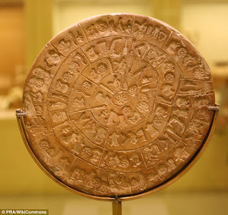
The Phaistos Disk

It is a curious archaeological find, likely going back to the late Minoan Bronze Age. The purpose, meaning and its original geographical place of manufacture making it one of the most famous mysteries of archaeology. There is a small number of comparable symbols known from other Cretan inscriptions, known as Cretan hieroglyphs. There are a total of 241 tokens on the disc and 45 unique signs. These signs represent easily identifiable every-day things. The Phaistos Disk captured the imagination of amateur archaeologists. Almost everything has been proposed, including prayers, narrative or an adventure story, a call to arms, a board game and a geometric theorem.

Phaistos Disk

The Phoenician Alphabet continues with the Proto-Canaanite alphabet, by convention called Phoenician from the mid 11th century. The Phoenician are descendants of the Bronze Age Canaanites who were presented by the Lebanon mountains by the sea and did not succumb to the Israelites or the 'sea people'. When they first appeared in western historiography, the Phoenicians already possess scores of colonies all around the Mediterranean and have extensive trade networks, extending as far as the Atlantic coast of Africa and the Black Sea, from which they challenged the Greeks and later the Romans for supremacy of the seas. Their artisans and artists were unparalleled, they were sponsoring together with King Solomon, ambitious naval undertakings. It was based on the principle that one sign represents one spoken sound.

Phoenician Alphabet

Besides Aramaic, the Phoenician Alphabet gave rise to the Greek and Berber alphabets. Separate letters for vowels would have actually blocked the legibility of Egyptian, Berber or Semitic, their absence was problematic for Greek, which had a very different morphological structure. All names of the letters of the Phoenician alphabet started with consonants and these consonants were what the letters represented. Some of them were unpronounceable by the Greeks thus several letter names came to be pronounced with initial vowels. The Phoenician letter 'alep' became the Greek 'alpha'. This development only provided for six of the twelve Greek vowels. Greeks created digraphs and other modifications such as ei, ou and o (omega).


Aramaic Alphabet

The Greeks

Greek Alphabet is the source for all the modern scripts of Europe. History of the Greek starts with the adoption of Phoenician letter forms and continues to the present day. Consequently, the Greek alphabet can be considered to be the world's first true alphabet. The alphabet of the early western Greek dialects, "eta" stood for a vowel, and remains a vowel in modern Greek and all other alphabets derived from the eastern variants: Glagotitics, Cyrilic, Armenian, Gothic (Roman and Greek letters) and Georgian.

Greek Alphabet

The Romans

Hundreds of years later, the Romans used the Greek alphabet as the basis for the uppercase alphabet that we know today. They refined the art of handwriting, fashioning several distinctive styles of lettering which they used for different purposes. They ascribed a rigid, formal script for important manuscripts and official documents and a quicker, more informal style for letters and routine types of writing. Serif's originated with the carving of words into stone in ancient Italy. Roman stonemasons started adding little hooks to the tips of letters to prevent the chisel from slipping, which turned out to be the very aesthetic as well as legibility increasing addition to type that we use to this day.

Roman Alphabet

I.dailymail.co.uk. (2016). [online] Available at: http://i.dailymail.co.uk/i/pix/2014/10/23/1414060633067_wps_5_Crete___Phaistos_disk___s.jpg [Accessed 12 Oct. 2016].

Madisonclarke.files.wordpress.com. (2016). [online] Available at: https://madisonclarke.files.wordpress.com/2011/03/roman-alphabet.jpg [Accessed 12 Oct. 2016].

I.ytimg.com. (2016). [online] Available at: https://i.ytimg.com/vi/b-Bqe5rfl5s/hqdefault.jpg [Accessed 12 Oct. 2016].

Quia.com. (2016). [online] Available at: https://www.quia.com/files/quia/users/noodlechild/pictures/GREEK_cup_trans [Accessed 12 Oct. 2016].

S8int.com. (2016). [online] Available at: http://s8int.com/images/glozel1.jpg [Accessed 12 Oct. 2016].

Upload.wikimedia.org. (2016). [online] Available at: https://upload.wikimedia.org/wikipedia/en/a/a9/Ba%60alat.jpg [Accessed 12 Oct. 2016].

Www2.econ.iastate.edu. (2016). [online] Available at: http://www2.econ.iastate.edu/classes/econ355/Choi/images/b/bb033.jpg [Accessed 12 Oct. 2016].

Citrinitas.com. (2016). The History of Visual Communication - The Alphabet. [online] Available at: http://www.citrinitas.com/history_of_viscom/alphabet.html [Accessed 12 Oct. 2016].